How do you convey large amounts information in an engaging way with limited newspaper space?
Statistics can provide interesting news stories, but reams of data can be difficult to present in print.
There is also the danger of bombarding readers with so many figures that they just give up.
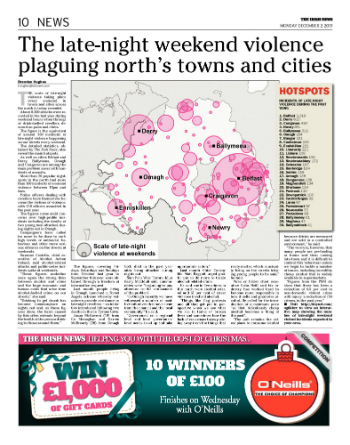
This was the familiar challenge for me when I put together a story on complaints and incidents recorded on school buses in Northern Ireland.
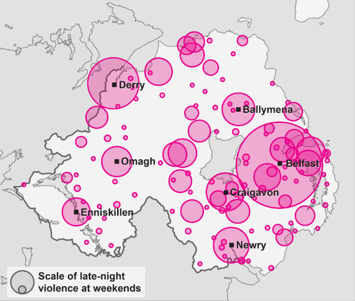
Through a Freedom of Information request, the north’s transport operator Translink disclosed details of more than 800 complaints and 75 accidents or injuries on school bus services.
The extensive data also included specific information on each individual incident and complaint including the location of bus services involved.
After sifting through and categorising the information, I used Photoshop to experiment with ways to display the details through an infographic.
The first attempt was less than successful. Squint and you might be able to see the text is supposed to look like a bus:

In the end I settled for the graphic at the start of this post.
The idea is simple, but presents the information in a more eye-catching way than a bland bullet point list.
With limited space in a busy Saturday paper, it helps to make the story stand out:

Web-based applications also provide opportunities to present stories in new ways that engage readers.
Here’s the same information in the form of a Google map:
And Datawrapper is perfect for creating simple charts and graphs. This helps to show how the number of complaints and incidents varies across Northern Ireland.


 I uncovered extensive data which revealed the number of fines and written warnings issued to Cardiff homes and businesses for failing to leave their rubbish out on the correct collection days. The information, revealed through FOI requests, identified the city’s problem areas for litter.